import pandas as pd
import ipywidgets as widgets
from IPython.display import display, HTML
import plotly.express as pxBuilding Interactive Dashboards with Voila and Jupyter
1. Introduction
Data visualization and interactive dashboards are powerful tools for understanding trends and making data-driven decisions. Voila converts Jupyter Notebooks into interactive web applications without requiring additional front-end development.
In this blog, we will explore how to use Voila, set it up, and create an interactive PM2.5 air quality dashboard with Plotly and Ipywidgets.
2. Installation & Setup
Run the following command to install Voila and required libraries:
pip install voila pandas plotly ipywidgetsTo launch Voila, run:
voila my_notebook.ipynbDeploying Your Voila App
Once your Voila dashboard is ready, you can deploy it on platforms like:
- 🚀 Binder (for free hosting)
- 🚀 Heroku (for scalable applications)
- 🚀 JupyterHub (for enterprise solutions)
To deploy with Binder, upload your notebook to GitHub and create a link using:
3. Key Features & Explanation
- Converts Jupyter Notebooks into interactive web applications.
- Supports interactive widgets.
- Hides source code from users.
4. Code Examples
Step 1: Load Necessary Libraries
This code imports essential Python libraries for building an interactive PM2.5 analysis dashboard:
- pandas – Used for handling and manipulating tabular data (CSV file).
- ipywidgets – Provides interactive UI elements like dropdowns, date pickers, and buttons.
- IPython.display – Enables displaying HTML content and widgets inside Jupyter notebooks.
- plotly.express – A powerful library for creating interactive and visually appealing graphs.
Together, these libraries help filter air quality data and visualize it dynamically based on user inputs.
Step 2: Load and Clean Data
# Load dataset
file_path = "Data.csv"  # Ensure 'Data.csv' is in the same directory as this script
df = pd.read_csv(file_path)

# Convert Timestamp to datetime
df["Timestamp"] = pd.to_datetime(df["Timestamp"], errors="coerce")

# Ensure PM2.5 values are numeric and clean data
df["PM2.5"] = pd.to_numeric(df["PM2.5"], errors="coerce")
df = df.dropna(subset=["PM2.5", "state", "Timestamp"])

# Unique states list
states = sorted(df["state"].dropna().unique())
This code loads air quality data from a CSV file, processes timestamps, ensures numerical consistency for PM2.5 values, and removes any incomplete records. It also extracts a sorted list of unique states for further filtering and analysis.
Step 3: Create Interactive Widgets
# Create widgets
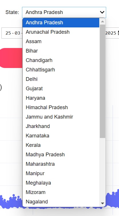
state_dropdown = widgets.Dropdown(
options=states,
description="State:",
layout=widgets.Layout(width="300px")
)
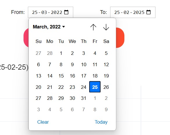
date_picker_start = widgets.DatePicker(
description="From:",
layout=widgets.Layout(width="200px")
)
date_picker_end = widgets.DatePicker(
description="To:",
layout=widgets.Layout(width="200px")
)
graph_type_dropdown = widgets.Dropdown(
options=["Line Chart", "Bar Chart", "Scatter Plot"],
description="Graph Type:",
layout=widgets.Layout(width="300px")
)
apply_button = widgets.Button(
description="Apply Filter",
button_style="primary",
layout=widgets.Layout(width="250px", height="50px"),
style={"button_color": "#ff416c"}
)
This code creates interactive elements (widgets) for the dashboard using ipywidgets. - A dropdown allows users to select a state. - Two date pickers help users choose a start and end date. - Another dropdown lets users pick the type of graph they want to see (Line, Bar, or Scatter plot). - A button labeled “Apply Filter” triggers the filtering process when clicked. These widgets make it easy for users to select options and visualize air quality data interactively.
Step 4: Define Function to Filter Data
# Function to filter and plot data interactively with Plotly Express
def filter_and_plot(_):
output.clear_output()
with output:
state_selected = state_dropdown.value
start_date = date_picker_start.value
end_date = date_picker_end.value
graph_type = graph_type_dropdown.value
if not start_date or not end_date:
display(HTML("<p style='color:red; font-weight:bold;'>⚠️ Please select both dates.</p>"))
return
filtered_df = df[(df["state"] == state_selected) &
(df["Timestamp"] >= pd.Timestamp(start_date)) &
(df["Timestamp"] <= pd.Timestamp(end_date))]
if filtered_df.empty:
display(HTML(f"<p style='color:red; font-weight:bold;'>⚠️ No data found for {state_selected} in the selected range.</p>"))
return
# Select appropriate graph type
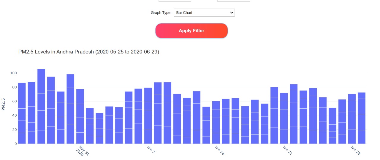
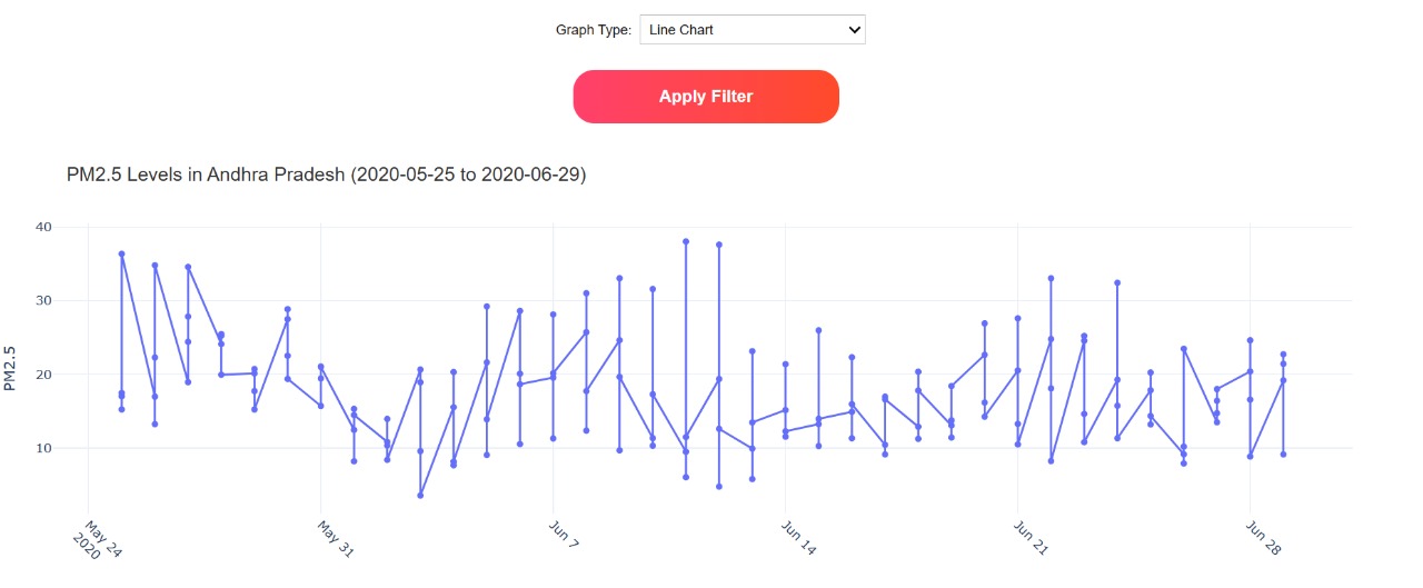
if graph_type == "Line Chart":
fig = px.line(filtered_df, x="Timestamp", y="PM2.5", title=f"PM2.5 Levels in {state_selected} ({start_date} to {end_date})", markers=True)
elif graph_type == "Bar Chart":
fig = px.bar(filtered_df, x="Timestamp", y="PM2.5", title=f"PM2.5 Levels in {state_selected} ({start_date} to {end_date})")
else:
fig = px.scatter(filtered_df, x="Timestamp", y="PM2.5", title=f"PM2.5 Levels in {state_selected} ({start_date} to {end_date})", trendline="lowess")
fig.update_layout(
title_font=dict(size=18, family='Arial', color='#333'),
xaxis_title="Date",
yaxis_title="PM2.5",
template="plotly_white",
margin=dict(l=40, r=40, t=80, b=40)
)
fig.update_xaxes(rangeslider_visible=True, tickangle=45)
fig.show()
This function filters and visualizes air quality data based on user input. - It retrieves values from the widgets (selected state, date range, and graph type). - If no dates are selected, it prompts the user to choose them. - It filters the dataset based on the user’s choices. - If no matching data is found, a message is displayed. - Otherwise, it generates a graph using Plotly Express, choosing between Line Chart, Bar Chart, or Scatter Plot depending on the user’s selection. This ensures an interactive and user-friendly experience for visualizing PM2.5 pollution levels over time.
Step 5: Style it using CSS
# Custom CSS Styling for UI
custom_css = """
<style>
    body {font-family: Arial, sans-serif; }
    .header { text-align: center; font-size: 26px; font-weight: bold; padding: 10px; color: #fff; background: linear-gradient(to right, #007BFF, #00C1FF); border-radius: 10px; }
    .container { display: flex; flex-direction: column; align-items: center; }
    .box { width: 60%; padding: 10px; text-align: center; }
    .button { width: 250px !important; height: 50px !important; font-size: 16px !important; border-radius: 20px !important; background: linear-gradient(to right, #ff416c, #ff4b2b); color: white !important; font-weight: bold; border: none !important; cursor: pointer; }
    .button:hover { background: linear-gradient(to right, #ff4b2b, #ff416c); }
    .dropdown, .date-picker { width: 300px !important; height: 40px !important; font-size: 14px !important; text-align: center !important; }
</style>
"""
This CSS snippet enhances the appearance of the interactive dashboard: - It sets a clean font style (Arial, sans-serif). - The header is styled with a gradient blue background, bold white text, and rounded corners. - The container aligns elements centrally for a well-structured layout. - The buttons have a gradient effect, rounded corners, and hover effects for better UI experience. - The dropdown menus and date pickers are resized and centered for consistency. This styling improves the visual appeal and usability of the dashboard.
Step 7: Display UI
# Display UI
display(HTML(custom_css))  # Apply custom CSS
display(HTML("<div class='header'>📊 PM2.5 Level Analysis Dashboard</div>"))  # Header
display(
    widgets.VBox([
        widgets.HBox([state_dropdown], layout=widgets.Layout(justify_content="center", padding="10px")),
        widgets.HBox([date_picker_start, date_picker_end], layout=widgets.Layout(justify_content="center", width="60%", padding="10px")),
        widgets.HBox([graph_type_dropdown], layout=widgets.Layout(justify_content="center", padding="10px")),
        widgets.HBox([apply_button], layout=widgets.Layout(justify_content="center", padding="10px")),
        output
    ], layout=widgets.Layout(align_items="center"))
)
📊 PM2.5 Level Analysis Dashboard
This snippet is responsible for displaying the user interface of the PM2.5 analysis dashboard. - It applies the custom CSS styles to ensure a visually appealing design. - The header with the title is displayed at the top using an HTML div. - The UI elements, including the state selection dropdown, date pickers, graph type dropdown, and apply button, are arranged using VBox and HBox layouts to structure them properly. - The output widget is added at the end to display the graph after filtering.
5. Screenshots & Visuals
Visual Elements
Dropdown Menu
Date Picker
Button

Graphs
6. Use Cases
Voila is a powerful tool that enables interactive and user-friendly data applications. Here are some practical scenarios where Voila can be highly beneficial:
1. Data Dashboards
- Voila allows users to convert Jupyter notebooks into interactive dashboards.
- It is useful for professionals who want to explore data visually without needing to write code.
- Businesses can create customized data reports with real-time updates using widgets and visualizations.
2. Machine Learning Apps
- Machine learning models often require user input for predictions; Voila provides a web-based interface for this.
- Users can input data, select models, and get predictions without accessing raw Python scripts.
- Example: A sentiment analysis tool where users enter text and receive an AI-generated sentiment score.
3. Educational Tools
- Voila enhances interactive learning by providing a graphical interface for coding exercises.
- Teachers can create hands-on notebooks where students interact with widgets instead of writing complex code.
- Example: A physics simulation where students change parameters (e.g., gravity, speed) and observe real-time graphical changes.
7. Conclusion
Voila makes it easy to convert Jupyter Notebooks into interactive web applications. We built an interactive air quality dashboard using:
- ✅ Voila for UI rendering
- ✅ Ipywidgets for interactivity
- ✅ Plotly for visualizations
This allows users to interact with data without needing to run code.